Under the skin of SY AI
What's this?
An open work journal for an experimental project digging under the skin of very 'top down' data on the impact of AI in the workplace, looking at South Yorkshire (where I live).
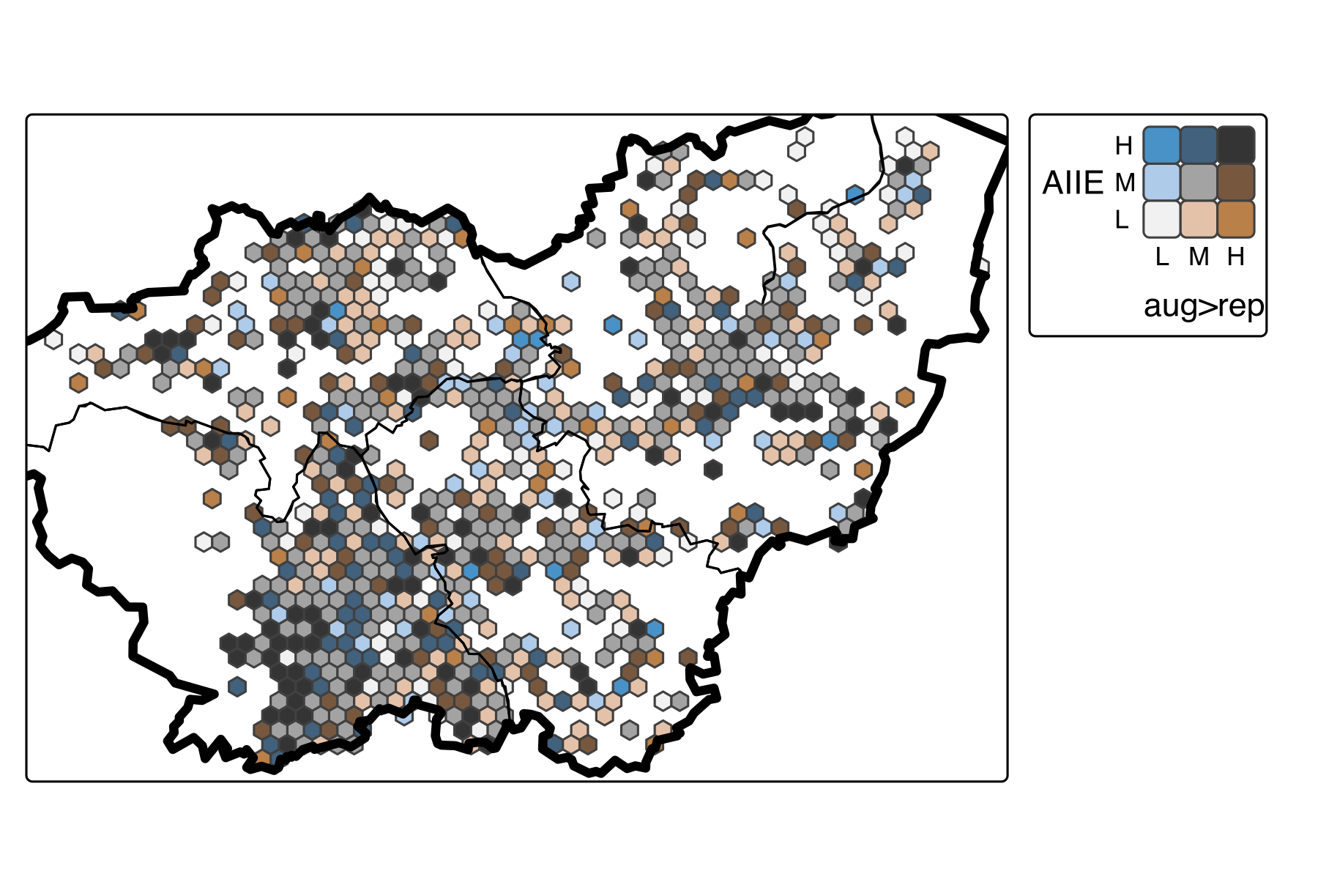
That 'very top down data' has been made by a few different people - I'm one of them. I was the main data bod for a Greater Manchester AI impact project led by Prof. Richard Whittle, tasked with applying impact metrics to businesses (github repo, method outline). The map below comes from applying the method to South Yorkshire.
Of this kind of 'exposure' analysis, FT journalist Sarah O'Connor - a big inspiration for me in trying to dig below the data - said on LinkedIn:
Economists: you know I love you, but I think it's time you gave it a rest with all these "which jobs are most exposed to AI?" analyses... If an economist tells you that 60 per cent of your job might, or might not, change in a way which might be better, or might be worse, does that really have any informational value at all?? At this point, everyone’s job is exposed in one way or another. What matters is how. Personally, I would prefer that economists focus their time and resources on empirical research into what is actually happening within workplaces, why, and what makes the difference.
Oof. Let me tell you one of the reasons this happens - a clean graph or map of where impacts may fall is very appealing, both to me as a data nerd, and to policymakers who will have asked for a 'robust' assessment (we too often mistake 'numbers-y' for 'robust' - quant analyses have a privileged position they don't always earn).
One aspect of the work I'm no longer happy with - see the map below - is the attempt at a 'jobs more augmentable than replaceable' scale. I'm not sure it has any empirical foundation. I'll use it to start this project off, because however shaky it is, it'll still lead me to look under the surface. But it's indicative of the privileged role this kind of data has - and also the trust placed in quant people like myself - that it could get through so unscathed. Peer review might not have stopped it either - the LLM method used is quite common now. But I think we need to stop it. More on that to come.
So increasingly, I feel like Sarah is right - about many kinds of data approach we use. I said on LinkedIn recently:
Neil McSweeney's "Sheffield City of Music" report for Sheffield Council ( https://lnkd.in/ejcY5w_4 ) is an epic piece of work connecting data, policy and community from top to bottom. Neil's approach to data for economic analysis has been hugely inspiring for me [that phrase again!]. He knows the region's music sector inside-out, and so understands what the data means - where it's able to shine a light, where it can lead us astray, how it threads through the people and organisations it describes. It's exactly the kind of data <--> ground truth gap-closing I wish I could be better at. I'm not convinced we can really understand a region's economy without approaches like this.
That's the idea I'm drawn to - neither the quant data nor the intelligence, but how they're woven together.
What would that look like for the AI impact data work? What would happen if I try to see where the data is pointing, but also to seek out its blindspots and look there?
Sarah O'Connor also has a brilliant new book out: "We are not machines: the fight for the future of work." In that, she says:
... new technology doesn't actually just unfold. It never has. It is created by people and implemented by people. How it changes the world is not just a technical matter, but a matter of power, control, design, culture, markets, institutions and ideas. (13)
Of the people affected:
They are not standing paralysed while a 'tsunami' of change breaks over their heads, waiting to find out whether they float or sink. They are protagonists in a story that, yes, is shaping them, but which they are also shaping. (14)
Those protagonists could and should also shape how data describing them affects them through policy. That would inevitably change many things about the entire data / people / action cycle. But what?
I can how data choices are immediately changed when thinking like this. I built the previous exposure analysis on top of Companies House data (from the open pipeline work I've being doing). We get rich, granular firm location, sector and employee data (and there's more to extract), though it has weaknesses. For the map below, that makes it possible to produce properly weighted values built on firms, and at geographies we choose. Great.
But if I'm trying to dig under the surface, that raises other ideas. I have about a 44% website match in South Yorkshire for firms over 10 employees - the web text is another window. It's also hugely valuable that we know who each firm is. I can look at places the data might suggest is interesting, look at who exactly it suggests. I could ask questions of the web text to see what connects them, what differs. Not in an ML text classification way (I did some of that to support SYMCA's LIPF bid, and ML on web text is the basis for Data City's RTICs) but more fluidly, more curiosity-led.
,,,
So - I want to test whether there's something I can do myself to deepen what the data work is for, by trying to connect it to the people, places and organisations it describes.
I want to leave the plan a bit strategically vague. In my previous academic life, that's a horrifying proposal - what, just jump in without a pre-defined methodology carefully laid out with a gantt chart and ethics review?
I don't know where this will go or whether it'll 'work'.
Maybe something more defined comes later, if this test shows any promise. But let's prototype first. There are a million ways to approach this. I might start with the simplest - just speak to people and listen. If this shows promise, more structure can follow. I can picture an iterative flow back and forth between the data and those it affects and describes. I can imagine this as a true, regional intelligence system that properly connects data, knowledge and action (the kind of thing Neil McSweeney's work above gets closer to than most else I've seen).
But that's all fantasy until I've tested. And if it comes to something more structured, I handily have an expert on-tap (my partner Helen) who, with her colleagues, created and tested a cutting edge collaborative data analysis framework (in mental health settings, but it's been picked up in a bunch of other places).
First step in the next post: go through the data for South Yorkshire and look for somewhere to start...
South Yorkshire AI exposure / augmentability map
Notes on the map:
- Two-variable hex map, each showing a relative-to-rest-of-Great-Britain low/medium/high value:
- AIIE is 'AI industrial exposure' index, taken from Felten et al's US data and applied to firms in Companies House (see the method outline for full details on how the crosswalk from US to UK is made, including the 'cascading to appropriate SIC per firm' method).
- 'Aug>rep' is a 'jobs more likely augmentable by AI than replaceable' scale. This does attempt to address another point Sarah O'Connor made in her LinkedIn post: "these calculations don’t tell you anything about whether jobs which are highly 'exposed' to AI are going to get better, or worse, or disappear altogether." The method idea isn't mine - build on repeated probabilities from LLM calls - it's in a few papers now. But I'm not happy with it now. We'll come back to that.
That said - as a suggestion guide for where to look, it could work. Why is it picking up a band of 'exposed but more augmentable' across South Sheffield, for example? Who are those firms?
Journal
Top entry is most recent.